Showing posts with label OUGD401. Show all posts
Tuesday, 22 May 2012
CONTEXT OF PRACTICE - publication finals
Monday, 21 May 2012
THEORY TO PRACTICE - changes after crit
Contents and Introduction
- Increasing the size of the text
- Correcting the contents section
- Removing the image to make the designer profile more relevant
Designer profile
- Introducing the image of Edward Meadham and Benjamin Kirchhoff from the introduction page in order to make the profile more relevant to it's content. Also gives you a sense of who it is the publication is discussing. Putting a face to name.
- Colour changes
- Creating a title for the profile page
Content
- Spreading the content out over four pages instead of two. Split the information into more manageable and readable chunks.
Meadham Kirchhoff content
- Spread the information over two pages, instead of one. Allows for more focus on the information.
What is Riot Grrrl?
- Moving the Riot Grrrl page to a new destination and adding an illustration on the facing page.
Final thoughts
- Including some final thoughts in the publication to sum my thoughts and feelings
Back of publication
- Including references, sources and things that have informed my work throughout
CONTEXT OF PRACTICE - publication summary
Although the kitsch debate continues to this day, hopefully this publication has shed some light on the possibility of the term being seen as something other than tacky and tasteless. I am not trying to say that all kitsch is wonderful, however, it would be narrow minded to look at it with such disapproval.
In design today, kitsch appears to be making a comeback - because it's fun, visually striking and it's even something to smile about. Meadham Kirchhoff mix this with a sense of playfulness and hyper reality.
Francesca Gavin, curator of the Soho House Group believes that the two designers 'fit firmly into a contemporary Japanese art aesthetic' associating them with the 'kawaii pop of Takashi Murakami' and the 'colour palette of painter Aya Takano.'
Their take on kitsch is extremely refreshing to see, and the social and political stance surrounding it adds a whole new element of meaning.
CONTEXT OF PRACTICE - final crit
1. What is the publication trying to communicate?
An argumentative piece on whether kitsch is good or bad art focusing on the designers Meadham Kirchhoff.
Strengths
Imagery is consistant with the topic content is relevant and in depth.
Improvements
Legibility could be improved by spreading out content.
2. How is the format of the publication relevant to the content?
Strengths
Illustrations effectively communicate the idea of kitsch. The content is flowing well through the publication. Good interactive qualities.
Improvements
Maybe if the publication had been packaged in a typically retro style it would be more relevant to the content. Would need some actual images of their work to be included.
3. Comment on the practical, conceptual and/or symbolic consideration of colour.
Strengths
Colourful, pastels, typical and recognisable to kitsch style.
Pastel colours compliment well.
Bright colour used sparingly and work well to emphasise elements.
Improvements
/
4. Who is the target audience?
People who are interested in history or want to understand kitsch.
Assuming the role of the audience, what is your reaction to the publication?
Are the illustrations supposed to be kitsch because we like them for their style.
The text could be more clear.
Little illustrations are kitsch and fashion displayed is definitely kitsch.
We understand kitsch better now.
Do you think this is the intended response? Explain your answer.
Yeah, we do understand kitsch better but we don't know whether we are supposed to love or hate it?
5. What context(s) would the publication be appropriate for? Explain your answer.
General art gallery/book shop.
Sold as a reference book.
College library.
6. Would it be appropriate for this publication to be viewed worldwide? Explain your answer.
Hard to understand UNLESS you have prior knowledge of artists and the idea of 'kitsch'.
The main points I picked up from the feedback was to do with the layout of the content and also the audience response.
In order to fix these issues, I plan on spreading my content out onto extra double page spreads. This will allow the text to be more legible. Although the prototype seen in the crit wasn't to the best standard, as the quality of print was pretty poor, the text could definitely be increased in size and lay out in more manageable chunks.
The audience response also asked whether or not they were meant to love or hate it. In order to clarify this, I will include a section at the back where I conclude and round up my thoughts and opinions on the subject matter.
Sunday, 20 May 2012
CONTEXT OF PRACTICE - revised essay
Choosing a particular period from the 1800 to the present, in what ways has art or design responded to the changing social and cultural forces of that period?
During the late 1950s, and blossoming into the 60s, something called a counter-culture became prevalent in England, that soon spread throughout Western Europe. The term counter-culture is used to describe the norms and values of a particular group that oppose those of mainstream society at that particular moment in time. Throughout these decades, the conventional social norms that the youth culture, mainly made up of the white working and lower-middle classes, opted to reject included capitalism, the cultural principles of their parents and the original support that emerged for the Vietnam War. From this, interest turned towards social issues, such as gay rights, and away from social conventions. This rejection of the mainstream soon took a hold of music, art, lifestyle and appearance.
Out of this counter-culture came an unmistakable influence on identity and design. As noted by Jobling and Crowley ‘the most self-consciously visible appearance of this phenomenon were the ‘mods’, who emerged in Britain in 1962’ (Jobling, P. and Crowley, D, 1997, pp211) Youth culture during the 1960s began to be taken over by this metropolitan movement, which flourished in Britain. Working-class and lower-middle-class teenagers were really taken in by this modernist culture that sought to gain identity and rebel against conventional behaviour. They were said to be 'aspirational, smartly dressed and secretive, the mods were a closed society that danced to rare soul records, spent a month's wages on a tailored suit, lost themselves in narcissistic dreams and paved the way for a new consumer culture.' (Melissa, 2011) These young people began to adopt a completely different sense of style to what was usually seen in big cities such as London. Influences came from far and wide – Italy and France in particular. They adopted ‘roman hairstyles, lightweight shiny suits, narrow ties and Vespa scooters’ (Thorne, T, 1993, pp184) that were said to denounce consumerism and the way in which fashion was dictated by others. Their impact on fashion also impacted art. It was the Mods who “first popularised the simple geometric shapes typical of the 1960s”. (V&A, 2011)
Mod influence on art stemmed particularly from customisation. ‘Customising of existing styles, symbols and artefacts became the hallmark of youth culture during the 1960s, a way of both ascribing a personal signature to something and of asserting creative autonomy as a consumer.’ (Thorne, T, 1993, pp184) A fine example of this is through the use of the Union Jack, which appeared everywhere, from within the home, to the wardrobes of the Mods. Pete Townshend, of The Who, famously wore a jacket made entirely from fabric in the style of the British flag, displaying a pop art mentality. A classic image is of Townshend in said jacket, smashing up a Rickenbacker guitar - 'The Mods deployed the flag, a symbol of imperialism, ironically in a way to unite individuals who did not necessarily feel patriotic in the usual sense.' (Theldman, C, J, 2009, pp35) As well as this, an extremely well known symbol, that is still seen today, is the Royal Air Force's red, white and blue target, otherwise known as a roundel. The Who made this simple symbol into something that was completely and utterly part of pop consciousness. It was there to epitomise everything that this culture stood for - an England where the working class youths could reject the conventional. It wasn't long until the U.S caught wind of the band, and soon everyone was wanting a little bit of what was said to be called 'The London Look.' Townshend claimed that he could see all the spectacular in what appeared to be objects and experiences that were simply mundane. People would flock to see the group purely for this jacket made out of flags. He stated 'a group is a fairly simple form of pop art, we get a lot of audience this way' (Theldman, C, J, 2009, pp35) This youth culture started to be seen as art, as a commodity of society. It was an underground scene that was soon to be sold.
Mary Quant was an example of Mod culture becoming a commodity, taking credit for the invention of the well-known mini skirt. Quant's fashion was said to 'celebrate femininity in a new way. She used lots of bright hues and atypical colour combinations, and unusual materials, while the skirts she designed became increasingly smaller' (Theldman, C, J, 2009, pp34) all of which is likened to this Peter Pan desire of a child to never have to grow up. They were modern, of course, and designed for every day life. 'I was making easy, youthful, simply clothes, in which you could move, in which you could run and jump' (Anon, The Telegraph) Quant made this acceptable and affordable, whilst representing a political and sexual revolution. The Mod female needed to epitomise this. In order to personify a teenage revolution, models were chosen especially, Twiggy being one of them. Her and Jean Shrimpton were used in order to embody the innocence and ease of Quant’s designs. However, it wasn’t just the designs that were representative of this culture, but Quant’s boutique named Bazaar became the spark for new ventures and young entrepreneurs, setting the standard. It was a new approach, and an innovation in retail. Although on King’s Road, Carnaby Street also became a main focus, taking on the idea of this Swinging London, mirroring all of the different changes that had previously occurred, and still were occurring, in culture and in society. They were both the so-called epicentre for social change.
Pop and Op art can be seen as the main focus of Mod culture and Quant’s designs. Op art in particular is synonymous to Quant’s work, and the 60s - ‘The monochrome geometrics prints perfectly complemented the bold shapes of the Mod look’ (Oldman, C, 2012) An evolution in design soon commenced, and the Op pattern, which simulated movement, began appearing everywhere. The five point Vidal Sassoon hair cut was reflective of this, however, actual designs featured primarily on dresses, not just those of Quant, but those that had also been created by the Scott Paper Company. They were known as the Paper Capers, and as the name suggests they were indeed made from paper, they were also extremely popular. They were said to capture the ‘vibrant, youthful, optimistic and consumerist zeitgeist’ of the 1960s. They were described as brief but spectacular, cheap and disposable, capturing this idea of instant fun. As well as this, when discussing Pop Art, Warhol prints also donned everything imaginable, most notably on Yves Saint Laurent’s Mondrian shift dress, that was featured on French Vogue’s front cover in ’65. It soon got the point where Mod style ‘came to refer to several distinctive styles, being essentially an umbrella term used to cover everything which contributed to the myth of the “Swinging London.” (Hall, S. and Jefferson, T, 2007, pp71)
As time went on, the Mod culture grew less and less popular. Jobling and Crowley argue that the whole concept soon became difficult to grasp onto because throughout the era ‘it was prone to continuous reinvention’ covering several different ‘sub-scenes’ (Jobling, P. and Crowley, D. 1996, pp213) A psychedelic rock and hippie culture began to become a lot more prevalent, turning into a prominent form of “alternative society”. It was a counter-culture that consisted of individuals whom hoped for Utopian lifestyles. They were well-known for dabbling in drugs, such as LSD, as well as being influenced by certain oriental philosophies. The Hippies wanted peace - they wanted an end to both the Vietnam War and the materialistic ways that society was stuck in. It marked a time for change and experimentation. Features of this period included the surreal, paisley patterns with contrasting colours, repetition and the use of hand-drawn lettering, which was both diverse and unconstrained. Letraset was mainly used during the 70s, becoming quite a prominent characteristic of Type Setting in this decade. There was a kaleidoscopic feel to most designs, with the morphing of objects and shapes, which adorned posters, various publications and record sleeves. One publication reflective of these aspects of 70s design was a member of the Underground Press - OZ magazine.
To conclude, the counter-culture of the 60s grew so much that it managed to take hold of an entire generation. A possible revolution had occurred in regards to the perception of art and design and also the way in which people produced it. A rejection of the conventional and support for the individual led to a whole new world of art, music, phrases and style, which are still seen in today’s society. Work produced during these decades countered what was originally viewed as accepted forms of art. Unfortunately, Pop Art is now seen to be ‘commonly reduced’ (The 1960s, 2011) in the Western world of today. It is not longer wholly viewed as a representation of counter-culture - ‘once branded as immoral, anarchistic, and revolutionary, the counter-culture of the 1960s [Pop Art] is not playfully imitated.’ (The 1960s, 2011) By 1966, the Mod scene was in fast decline, with Dick Hebdige arguing that ‘the mod subculture lost its vitality when it became commercialised, artificial and stylised to the point that new mod clothing styles were being create “from above” by clothing companies and TV shows, rather than being developed by young people customising their clothes and mixing different fashions together.’ (Hebdige, D, 1993, pp174) The psychedelic rock and hippie culture, on the other hand, continued to grow and thrive. A resurgence is said to be happening, leading it to take it’s own place in our society today.
Bibliography
Jobling, P. and Crowley, D. (1997) “Graphic Design: Reproduction and representation since 1800 (Studies in Design)” Manchester University Press
Melissa, (2011) “This is Mod” [online], available at: http://sxsw.com/node/6879 [accessed 13th May 2012]
Thorne, T. (1993), “Fads, From Acid House, Fashions to Zoot Suit and Cults”, London, Bloomsbury Publishing
V&A, 2011, History of 1960s Fashion and Textiles [online], available at: htttp://www.vam.ac.uk.vastatic/microsites/1211_sixties/history_page.htm [accessed 16th January 2012]
Oldman, C. (2012) “Op Art in Fashion and Design” [online], available at: http://www.op-art.co.uk/op-art-fashion/, [accessed 13th May 2012]
Hall, S. and Jefferson, T. (2007) “Resistance Through Rituals: Youth Subcultures in Post-War Britain (Cultural Studies Birmingham)”, Second Edition, Routledge
Theldman, C, J. (2009) “We Are the Mods": A Transnational History of a Youth Subculture”, Peter Lang
Anon. “The Glory Days of King’s Road” [online], available at: http://www.telegraph.co.uk/expat/expatpicturegalleries/8426600/The-glory-days-of-Kings-Road.html?image=4, [accessed 13 May 2012]
Johnson, k. (2011) “Are You Experienced? How Psychedelic Consciousness Transformed Modern Art” Prestel USA
Jobling, P. and Crowley, D. (1996) “Graphic Design: Reproduction and Representation since 1800” Manchester University Press
The 1960s, Anon. (2011) “The 1960s, Summary and Analysis” [online] available at: http://www.shmoop.com/1960s/culture.html [accessed 20th January 2012]
Period Style (2007), Anon. “1960s” [online] available at: http://www.bbc.co.uk/homes/design/period_1960s.shtml [accessed 17th January 2012]
Art and Books and Design, Anon. (2009) “60s and 70s Book Graphic Design” [online] available at: http://www.found-nyc.com/blog/2009/01/12/60s-and-70s-book-graphic-design/ [accessed 18th December 2011]
Hebdige, D. (1993) “”The Meaning of Mod”. In Resistance Through Rituals: Youth Subcultures in Post-War Britain” Routledge
Thursday, 17 May 2012
THEORY TO PRACTICE - possible covers
A simple net designed to hold the publication, with an MK illustration on the front and the 'All About Kitsch' tab on the back.
Although not very extravagant, the illustration on the front speaks for itself, not too overpowering, displaying the aesthetics of the rest of the publication. The cover has been made slightly larger in order to accommodate the final publication. The plan is to use ribbon in order to tie the cover shut, adding something special and quirky to the item. The colours will all tie in nicely together, portraying a candy themed sentimental kitsch.
The right hand side of the cover will be the space designed for the publication to be pulled out of, with plenty of room, so that it does not end up getting stuck. The ribbon tie will secure it.
These will be printed and tested, and if they are a little bit too simple, something else will be created to hold the publication. I also fear that as the publication may be quite thick, even though the scale has been changed, the publication may not fit inside with ease. This will have to be tested.
THEORY TO PRACTICE - publication so far
Here is a view of the publication so far that has been exported from the InDesign document. You can get a better understanding from this on how it's all going to fit together.
The inspiration page, and sticker page, have been left separate as these will have to be put into the publication once printed. Hopefully this will work out as planned.
The problem that may arise in the crit, I believe, will be to do with readability as the text has come out quite small after being printed and scanned back in. I personally feel already that it could be spread out a bit more, as there's a lot of information in one place. The audience would be more likely to spend time reading it if it was a lot more manageable, and put across more pages.
The order of the pages may also be changed, in order to create a better flow and more understandable arrangement.
THEORY TO PRACTICE - illustrations and pages
To make these posts a lot more organised, I am going to categorise all of my illustrations and pages under their particular title on the contents page, showing how each section has developed into it's final stage.
My desktop at one point was so cluttered with files and images that I didn't really know where to begin, how to find anything or what to do.
As there has been a lot of editing, moving around, colour changes and so on, it will be much more manageable to show it this way.
In the final booklet, there are 20 pages, including front and back, in a 10 page spread.
The contents are as follows:
Front Cover
Using the images one of my previous post, I began to draw up some illustrations for my publication. I didn't want to simply use the pen tool to trace the images as this would kind of defeat the point in me even doing them. I therefore printed each image off at a large scale and used these as reference to draw up my own images. These were to be done as accurately as possible, however a few differences were made. With drawing not being my strongest point, I'm extremely pleased with how these came out.
Once drawn up in pencil, the lines were gone over again in a thick black berol pen so that the scanner could pick up on them. This would then make it easier to live trace once in Illustrator. On some occasions, there were gaps where the lines hadn't quite joined, or some lines weren't as thick as others, however, this was easily fixed, and in some cases this added a lot more character to the illustrations.
Name Tag
The name tag is one that has been used by Meadham Kirchhoff before, normally on their invites or more notably on their nail wrap packaging. The style can be seen on a couple of their products.
Using this, I was able to draw up my own tag, and also use a similar style when it came to applying it on other pages and on other words.
Invitations designed by Hato Press
Nail Wraps available at Topshop
Model 1
On some occasions, I felt that the colours needed to be changed, as they either clashed too much, or I couldn't quite find the exact match. However, most were kept to be the closest match to the original image.
Once a few illustrations were complete and coloured, it was time to start looking at the aesthetics of the publication and how it was going to start coming together. The idea of using both illustration and photograph was a possibility, so this was experimented with to begin with. The hand rendered on the image works well. It's playful and I feel that the subject is appropriate to the model.
Model 2
Starting to look at models and aesthetics from the SS12 show - candy colours, lace, ribbons, kitsch symbols, cartoon references.
Possible 1
Possible 2
In order to fit in better with the whole aesthetics of the publication, I decided to make it reference the SS12 show a lot more. A secondary image was used that was taken in their studio of some of the things that surround the two designers whilst their working. I feel this page reflects the topic much better, and ties in with the way the rest of the publication is looking.
The model was originally facing the other way, however it was decided that it would make much more sense for her to be facing in the opposite direction of the title. It also allowed more of the image underneath to come through.
Introduction
Design Sheets
Edward Meadham and Benjamin Kirchhoff
Obviously people who read my publication probably aren't going to be aware of who Meadham Kirchhoff are. Assumptions can't be made that the audience knows all about them, what they do and so on. Therefore, a bit of background on the two designers will be needed. To make things a little bit more personal and friendly, an illustration of Edward Meadham and Benjamin Kirchhoff will be included, as well as a designer profile etc.
An image that expressed them as individuals and designers was chosen, as well as an image that also displayed some of their inspirations and characteristics of their work.
A few things on the illustration were changed from the original image. All the little posters and pictures etc in the background were photographs, or type, therefore I picked a selection of similar images and included these to strengthen the theme.
Content
Possible 1
I started to work on a possible introduction for the publication. I'm not sure whether or not this is the right place for the image but for now it seems to be working. It's a nice little introduction to the piece, displaying what it's all about and what will be discussed. The Meadham Kirchhoff name tag in the corner is one that has previously been used by the designers both on their invites and on their nail wrap products.
Possible 2
Possible 3
Seeing how it would lay out as a double page spread. On the left hand side there is a short definition of the word 'kitsch' which I think is vital to the publication and the understanding of it.
Designer Profile
Design Sheets
In order to introduce the designers to the audience, a profile will be included to give some brief information on the two. The profile is taken from the London Fashion Week website and it covers a number of important facts and questions. It's always good to know a bit of background in a simple question answer format.
Content
Models 1
A selection of models were drawn up that could be put on the facing page. A simple image was needed to go along with the profile, reflecting their recent designs.
Model 2
Although from the SS12 show, I feel that this illustration just doesn't fit in with the rest of the publication. For some reason it just looks really out of place, be it because of the colours or perhaps I'm just unhappy with the drawing. I decided to see if it could still be used, and I tried to put it into a different context.
Photo Frame 1
One of my peers suggested to me that it might be quite interesting to display the illustrations in a selection of little photo frames, in a range of sizes. This kitsch design was chosen for the frame.
As well as the use of illustration, as photograph was used at the beginning of the publication, I decided to look at the possibility of including it elsewhere. I experimented a bit with putting image behind the frame, looking at the contrast between the two. The opacity of the image was lowered to create more of a glaze, and to bring the colours down to the same level as the pastels that surrounded it.
This isn't as effective as I hoped it would be. The photographs seem a little bit out of place as they don't compliment each other in the way that the front cover does.
Photo Frame 2
I wondered whether or not it wasn't working because of the type of frame that I'd used, as it was very busy, and a little bit extreme. Some simpler frames were drawn up, and scanned in to create a live trace. I experimented with them for a while, but I feel the idea just wasn't working. I was trying to push something that overall I really just didn't like the look of.
Photo Frame 3
Possible 1
Here are some of the photo frame designs that I played around with. I'm not sure if it's the colours, or the composition, but the more I looked at this page the more I disliked it. It annoyed me so much I deleted it from the publication. My dislike for yellow may have something to do with this, however from the beginning the illustrations weren't the best, therefore it wasn't going to work.
Possible 2
Different sizes and composition was experimented with. This would be the preferred design, yet it just wasn't falling into place.
Possible 3
The idea was scrapped completely. As the left hand page looked a little bare, a title tag was created to introduce it. This makes the page stand out a lot more, and makes it more obvious. It needed some sort of title, otherwise it was just sort of there.
On the facing page, a colourful illustration was placed to contrast with the simplicity of the profile.
Possible 4
The yellow of the image above slowly started to flow into the colour of the models hair on the second page, therefore more of a contrast was needed to separate the two. This is much more effective and creates a nice balance between the two. This is an improvement on the original idea.
Inspiration
Design Sheets
After considering what exactly was going to go into the publication, I decided that the use of little interactions was well suited to certain aspects of kitsch. It will make the publication a lot more playful and allow the reader to interact with it as well as just reading a whole load of text. A lot of imagery will also help in making the publication relevant to the content, as well as making it reflect the characteristics of kitsch.
With this in mind, I wanted to display the different aspects of Meadham Kirchhoff's work, what it was that inspired them and how this related to kitsch imagery and objects. In order to show this, a little pull tab seemed like an interesting possibility.
Symbols
Strip
A selection of symbols were drawn up using different aspects of the SS12 show, be it accessories, inspirations, or imagery used. These were to go on the pull tab, with a little hand written note at the bottom exclaiming 'pull me'. The tab was measured up so that it wasn't going to be longer than the A5 page, and a title was also created using my own hand written type.
Pull Tab Page
I measured up a little box on the main page that would fit the tab in. The only issue that may occur is how I cover up the back of this page in order to keep the tab secure. I create a mini prototype to see if it was possible, and it doesn't look too messy by just sticking the 'inspiration' image to a blank double page spread.
Inspiration Page
This is the page that will stand next to the interactive page. It displays a long list of inspirations, like and features. This is a useful page to have as it quickly and efficiently gives people a look into the world of Meadham Kirchhoff. A list is a simple way of showing how the two designers reflect kitsch characteristics.
Kitsch - what is it all about?
Content
As this one of the main sections for content, I wanted to keep it clean and simple, but still keep the same aesthetics seen throughout
Background
To liven things up a bit, and instead of just having a solid background, I decided to create a pattern that could be spread across the two pages. So that it wasn't too busy or distracting, I drew out some simple shapes that could be filled with colour. They're appropriate to the theme, and add that little bit of extra aesthetic to the content.
The drawings were scanned in, live traced and converted to live paint. I then repeated the shapes to create a larger scale pattern, filling them in with pastel shades.
Possible
In order to reflect the style of a zine, with a hand rendered, photocopied effect, I chose to write up the content, print it, then re-scan it, giving the marks and lines of the raised paper. This shows reference to work that inspires Meadham Kirchhoff. It gives that cut-out, stuck-down feel. It also allowed to me to split up the content into manageable sections.
Meadham Kirchhoff - kitsch?
Content
Possible
Here, a similar style to the above content has been used in order to create flow and continuity. Little symbols have also been added for extra aesthetic qualities, however, the background was kept a simple block colour as the adjacent page is quite busy.
Show details and review
I wanted to create a section that allowed the audience to get a flavour of what a Meadham Kirchhoff show is like. In order to bring in someone else's opinion, I looked at using a report from a credible and reliable source.
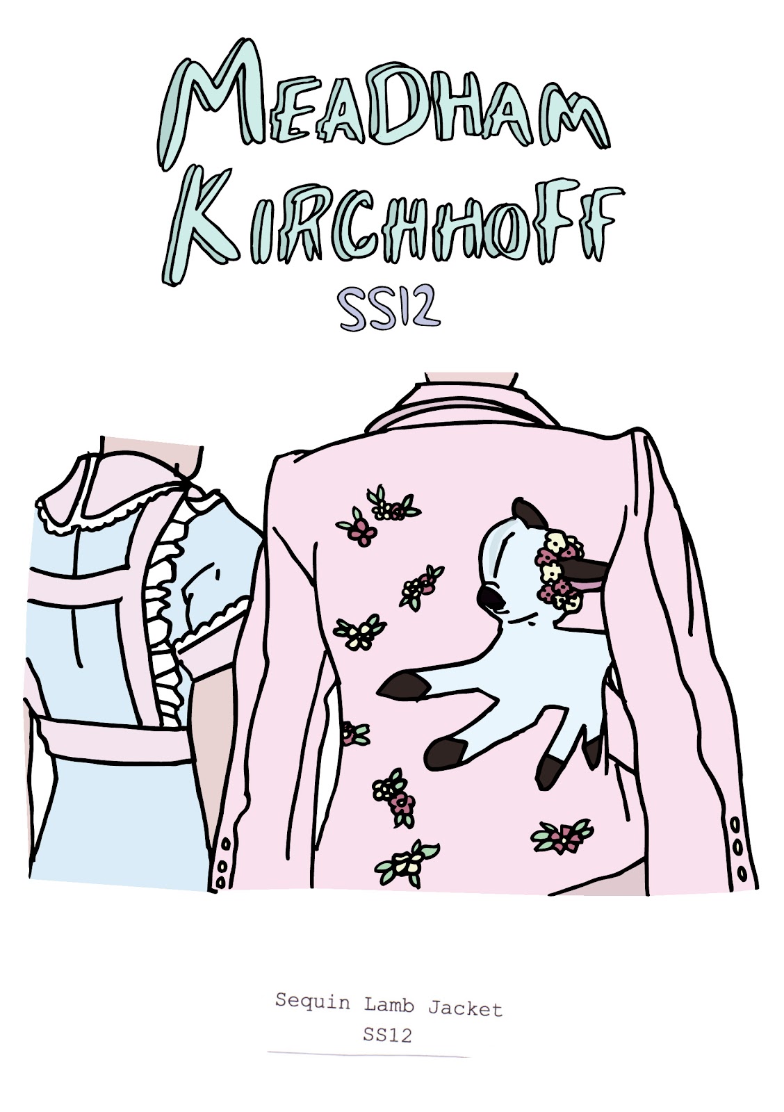
Each detail included is representative of the theme, and allows for a closer look into the world of MK. Each illustration shows a specific and popular design, that is recognisable and known to be their work.
The background was kept white to keep all focus on the details of the illustrations.
Content
Main Page
Page 1
Page 2
Page 3
Page 4
Page 5
Sticker Page
Design Sheets
Below is the final of the sticker page. This will be an interesting addition to the publication. My peers were questioned on whether or not these are something that they would bother using and whether or not the actual images were something that they would be interested in having. The feedback was positive, and it was said that the stickers and fun and quirky and something that they would like to own.
Front
Back
Subscribe to:
Posts (Atom)