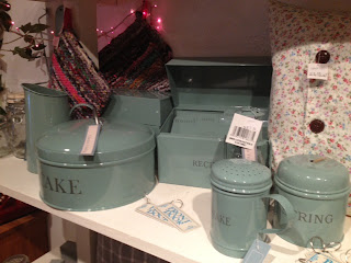
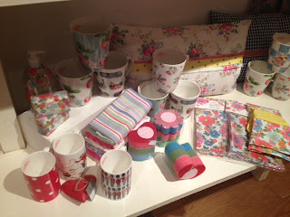
In order to gain an insight into existing home and bakeware, I spent time over Easter collecting a range of images from shops that I visited. This allowed me to gain a better understanding of how current bakeware is displayed in shops, and also the types of colour and pattern used for this sector. It has also made me aware of the type of products that are currently available, and whether or not there is anything out there that relates to my concept.
I found that a lot of pastel shades were used, that would typically be associated with a female audience, and quite vivid colours were also incorporated, such as pinks, greens and oranges. The visual displays of the items were extremely aesthetically pleasing, and they definitely drew you in. With products like this, I always find that I want to purchase items that I don't even need simply because of the nice patterns and colours. This is definitely a big feature of the bakeware industry.
Although a lot of the colours are associated with a female audience, I believe that the type of patterns and colour used can still be attractive to the male audience. I will try and make sure my products appeal to both genders through the use of appropriate colour, format and pattern.


No comments:
Post a Comment