
Stretch Island Fruit Company by Ptarmark, Inc.
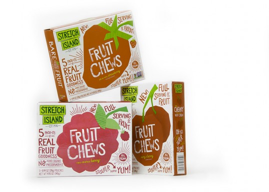


By looking at food based products, I am informing my design development, and seeing how a similar visual can be applied to a different format. Above, these healthy fruit based chews emphasise the fact they are full of real fruit and have no preservatives in them. This message is delivered through the use of fun and playful illustrations, and through hand drawn type. By using these kind of visuals, health becomes more fun and visually interesting. These quirky little fruit designs attract the customer and create great shelf appeal. There are also a range of products available which shows how the illustrations can be applied to different formats and sizes.
Oatworks by Pearlfisher
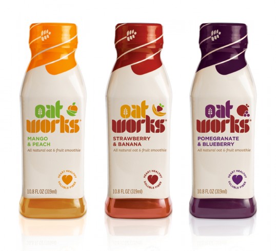
This design for Oat works is for a range of natural and heart healthy juice drinks. They therefore share similar attributes to the Feel Good drinks. Each bottle uses a vibrant colour in order to reinforce the ingredients within each bottle, and this also effectively emphasises the taste of the product. The heart included on the products draw attention to it's health properties and benefits, therefore allowing the consumer to know straight away that the drink is good for you.
Student work by Ashley Hohnstein


I feel it's always helpful looking at student work, as it shows the type of processes that are available and the type of things they are capable of doing. This time, the packaging is for muesli, called 'The Good Stuff'. Straight away, the customer is aware of the health benefits of the product, which is important. Colour has then been used to reinforce flavour, and there is a mixture of both illustration and digital image on the packaging. The format itself is extremely innovative, as the lid can be used as a way of measuring out one cup of the product. In addition to this, to further highlight the health benefits, small illustrations have been used of the ingredients on the side of the packaging.
More by Kayhan Baspinar
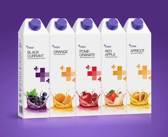

After looking at a product called Juice Burst, which featured digital image, I wasn't very impressed with the overall visuals. As I usually go for an illustrative look, I wanted to see how effective digital could actually be. This packaging is much more effective than Juice Burst, and I feel it uses the real life fruit image to it's advantage. The overall appearance is much cleaner, fresher and portrays the health benefits more effectively. It also shows range, and how the visuals can be applied to different stocks and formats. The bottles above take on really interesting forms, that are different from the standard juice drink. Overall, these products are bright, vivid and really display the 'juiciness' of the products inside.
No comments:
Post a Comment