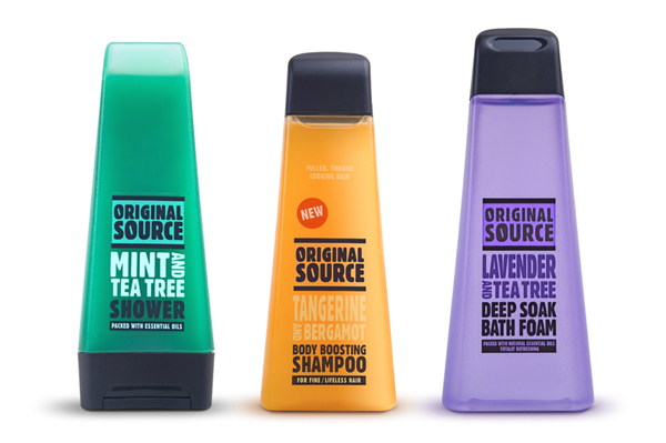
Original Source
The Original Source products are always quite funky, and one of the main selling points behind the products is the colour of shampoo or shower gel itself. These vibrant colours really reflect the scents of the products and the ingredients that are in them. Original Source pride themselves for including just that - the original source. For example, they include a tonne of whole lemons within their lemon scented product. In terms of design, I feel that the format of the bottles are quite visually interesting, and the shape would stand out from it's other competitors. The type is bold and minimal, which works well against the colour of the product.
Herbal Essences
One of the things I like about the Herbal Essences products is how the shampoo and conditioner fit snuggly together due to the form they take. This is further emphasised by the product name of 'long term relationship'. The bottles themselves are vivd and bright, and would therefore successfully stand out on a shelf. There isn't much in terms of pattern, however, this shows how a haircare product can be successful without it.
Bed Head Tigi
I have always taken a keen interest in Bed Head products. I feel their designs are really contemporary, and fit the more up-market haircare range. These products appeal to a younger, more 'hip' audience, through the use of barcode visuals and quirky metallic shines. Again, this shows how a hair care product can work without pattern, however, for my Batiste products, pattern is necessary in order to fit in with the existing range.


No comments:
Post a Comment