
Crabtree and Evelyn


The illustrations applied to this packaging are much more linear and simplistic in comparison to the other designs I looked at by Crabtree and Evelyn. A singular vivid colour has been used to reflect the scent of the products, and particular fruits have been included also. This is then contrasted by the addition of a bright orange ribbon, which adds an extra dimension to the packaging. It is also interesting to see the products from the outside, standing in their own little window.
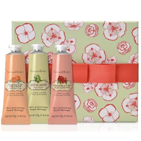
Bold contrasting colours have been used here to create an eye catching product. Crabtree and Evelyn's use of ribbons in bold solid colours are extremely effective, and allow the pattern to be broken up slightly. It also make the packaging more of a keepsake, becoming something that you would want to have in your home.

Bold contrasting colours have been used here to create an eye catching product. Crabtree and Evelyn's use of ribbons in bold solid colours are extremely effective, and allow the pattern to be broken up slightly. It also make the packaging more of a keepsake, becoming something that you would want to have in your home.

More detailed illustration has been used on this packaging, therefore it has been spread out more, and has not been overdone. A variety of shades of green create the desired scent, and little shaped windows allow the product to be viewed from the outside. The products are just as beautiful as the packaging and therefore should be visible to the customer.
No comments:
Post a Comment