
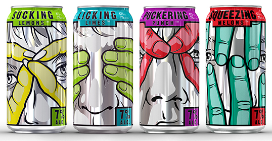
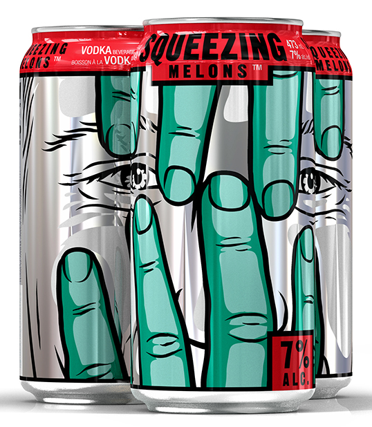
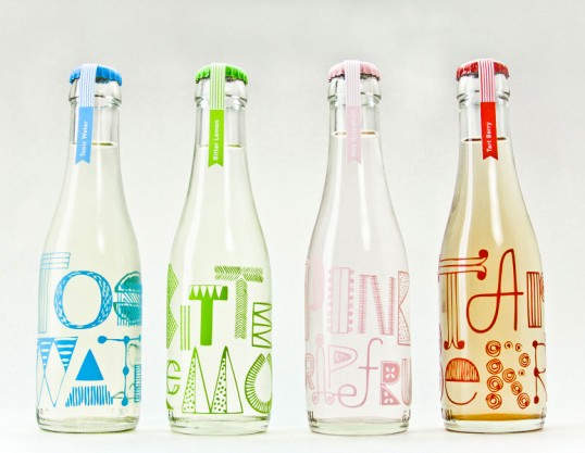
These sparkling alcoholic fruit drinks are extremely vivid and eyecatching. They would have great shelf appeal and would stand out to customers when in a shopping environment. Although not a health-orientated fruit drink, I feel that it's interesting to see how a product can be used to create something extremely effective. It's great shelf appeal will be something that I consider when designing my products, as they need to be joyful, bright and attractive. Another great feature of this product is the way the cans work together to create an image. This is a really innovative approach, and shows thought and consideration. It would also encourage the customer to purchase more than one drink in an attempt to re-create the above illustration. The cans therefore become keep-sakes due to the interesting visuals.
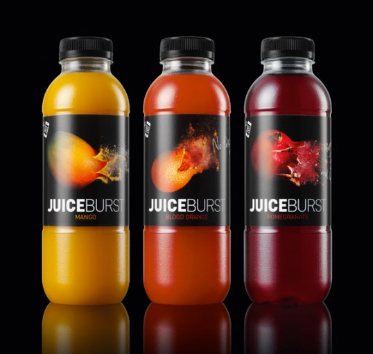

Although I don't particularly like the overall aesthetics of these juice products, I was particularly interested in the effort put in in order to create them. Artem, the special effects company behind some of the opening ceremony scenes at the Olympics, blew the fruit up which was then filmed at high speed. I feel the fruit as stand alone images work well, however they don't stand out to me as part of this fruit juice packaging. The image would have much more impact on a larger scale. The concept is there, however the design doesn't catch my attention in the way that you would expect it to.
The Juice Cleanse by Glasfurd and Walker
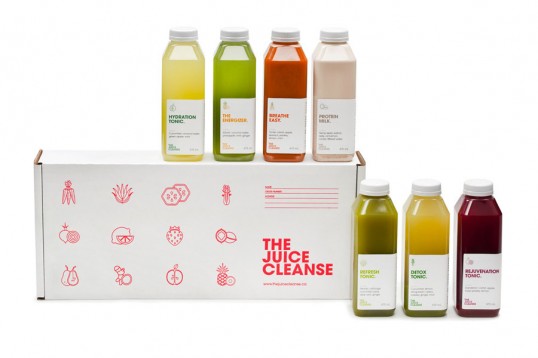


With these products, I like that there is a lot of emphasis on the health benefits of the drink and the promotion of overall health, happiness and energy. Although not the joyful in your face visuals of Feel Good, there are similar ideas there. One of the things Feel Good were looking for within their brief, was pushing the fact they had 100% natural ingredients and no artificial extras. The Juice Cleanse therefore shows one way of presenting this. The packaging is clean and simple, referencing appropriate colours and linear illustration.
Thise Mejeri by Randi Sjaelland


Throughout my research, these are this is the packaging that stood out to me the most. The colours themselves are what initially attracted me, making me want to purchase and consume the product, which is evidently an important factor. The colours used are beautiful and work harmoniously together. The packaging is high-end, and therefore available in more upmarket stores. This allows the products to use these wonderful glass milk bottles, with a matte finish. Even the stand alone images of the products taken with the appropriate fruit are extremely eye catching, and the bottle becomes something that you would want to keep after consuming.
Coffee Talk by Nimrat Brar
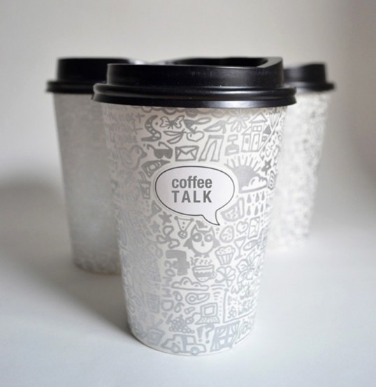

Although not a juice drink, these coffee cups really stood out to me because of the illustrative design. They displayed how illustration could be applied to a product, and how a label could be used so that the title of the product stood out. Pattern is something that I evidently want to explore during this brief, therefore this has helped me to understand the ways in watching it can applied to the surface. This type of design makes you want to purchase the product, it also makes you want to keep it after use, which is something I personally want to try and achieve when creating my bottles.
Student work by Miriam Altamira

The reason I chose to look at these designs was mainly down to it being student work. It was interesting to see how the individual was able to mock up the products in a similar environment to the one i'm in. Without professional printing techniques, this shows how image can be applied. In the comments, someone else also asked how this had been done. With being a student, they questioned how they found an affordable way to produce the bottles. This is something I will also be taking into consideration. In addition to this, these products have a great use of typography, and also colour, which helps separate flavours.
No comments:
Post a Comment