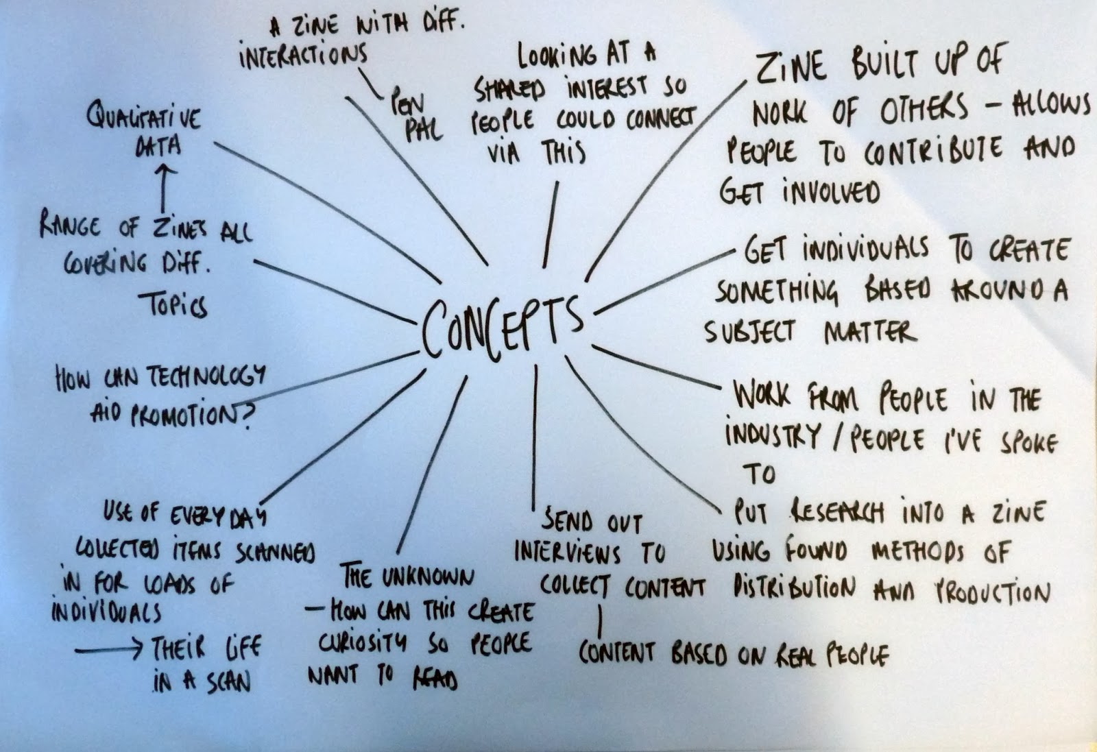
Idea development
Now that I had collected all of the information I needed for my practical, I could began to look at possible aesthetics. I needed to take all of my research into account in order to follow production and distribution methods, as well as creating aesthetics similar to that seen within the zine community. Using my responses to guide me, I began by creating some hand type using words from the quotes included on Jenna's interest sheet. This way, I could use a cut and stick method to build sayings and images.
These images were then scanned in and digitised so that they could be positioned and laid out in order to build up areas of quotes on the page. Each word or phrase was made into a separate image so that it was easier to handle and work with.
Using illustrator, the layout was decided for the quotes, experimenting with illustration and type.
After experimenting with this method for a while, I felt that it wasn't quite appropriate and that I wasn't fully synthesising my practical with my written element. I feared that I was utilising the DIY and cut and stick methods as much as I could be and therefore felt that this was the wrong direction to be going in. I wanted to create something really reflected the zine community, using an aesthetic that would attract the intended target audience.


No comments:
Post a Comment