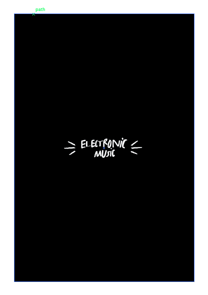
With these quotes, I could then begin to consider layout and format further. I set out to produce sections for ten different individuals, each containing six pages:
- A symbol
- Name
- Title
- Main Quote
- 2 x pages of type and image expanding on the interest
Chosen Interests
Jenna - space
Andy - star wars figures
Eve - all girl bands
Tom - knolling
Sam - climbing
Simon - rollerblading
Joel - cooking tasty treats
Martin - electronic music
Katie - David Attenborough
All type and illustrations were hand drawn and then digitised. This was because of the quality of the scans, which was quite poor. Final layout will then be created through the use of the original cut and stick methods, with a little bit of help from technology to improve the quality of certain aspects.
Symbols
I then drew up some symbols that would be relevant for each interest. The illustrations were kept simple and minimalistic, reflecting an area of the individual's chosen topic.
Name
The name of each person was the hand written in order to create a solid title for each section. This would also allow the user an insight into who the interest belongs to in terms of gender etc.
For the title pages, each illustration was digitised so that the stroke could be changed to white. This would allow for an interesting contrast, breaking up the white space. As the entire publication will be printed in black and white for cost purposes, it is interesting to see how these two colours can be experimented with in order to create different aesthetics.
Quotes
Each quote was handwritten, using different styles and illustrations to add emphasis and playful elements. I wanted to include quotes as this would make it much more personal, offering a first hand account which could aid in the facilitation of relationships.
The last two pages of each section were made up of both type and image. The type used was taken from the responses, offering a bit more insight into their interest in terms of why the like it, how long they've liked it or some facts regarding the subject. The images are relevant to the topic, and offer and visual image that allows for a better understanding of the content. The images have been kept greyscale, as this is how they will be printed in order to keep cost to a minimum. When printed and scanned, the images will lose some quality, however, this will add to the overall aesthetic and will be reflective of it's DIY nature.
Links to images used:
http://www.dreamstime.com/stock-image-colorful-rock-climbing-wall-ropes-image15471631
http://brooklynbrainery.com/blog/organize-your-desk-always-be-knolling
http://www.palmbeach.k12.fl.us/CongressMS/20082009/Businessyaritza/PP.html
http://theswca.com/images-misc/RALPH1.html
http://rb-news.com/2013/04/page/7/
http://blog.smartset.ca/2013/10/new-wave/
http://www.theguardian.com/tv-and-radio/2011/mar/02/tonights-tv-jamies-dream-school-attenborough
http://mcbracey.wordpress.com/2011/12/06/menu-monday-yes-i-know-its-tuesday/
http://wugange.com/galaxy-wallpaper-tumblr-18298-hd-wallpapers.html
http://www.sofeminine.co.uk/celebrities/all-saints/album840720/all-saints-fan-club-album-20838676.html
http://bikinikillarchive.wordpress.com/photos/
http://sf.funcheap.com/star-wars-film-night-free-popcorn-drinking-games-haight/


No comments:
Post a Comment