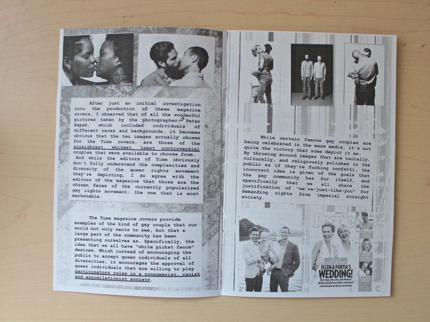
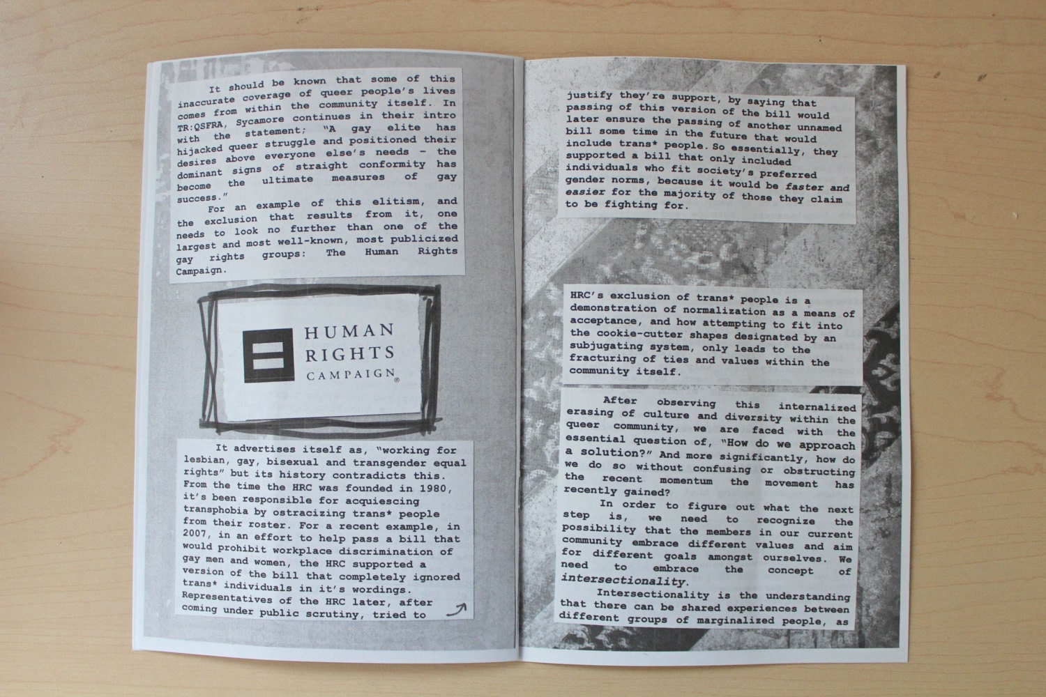
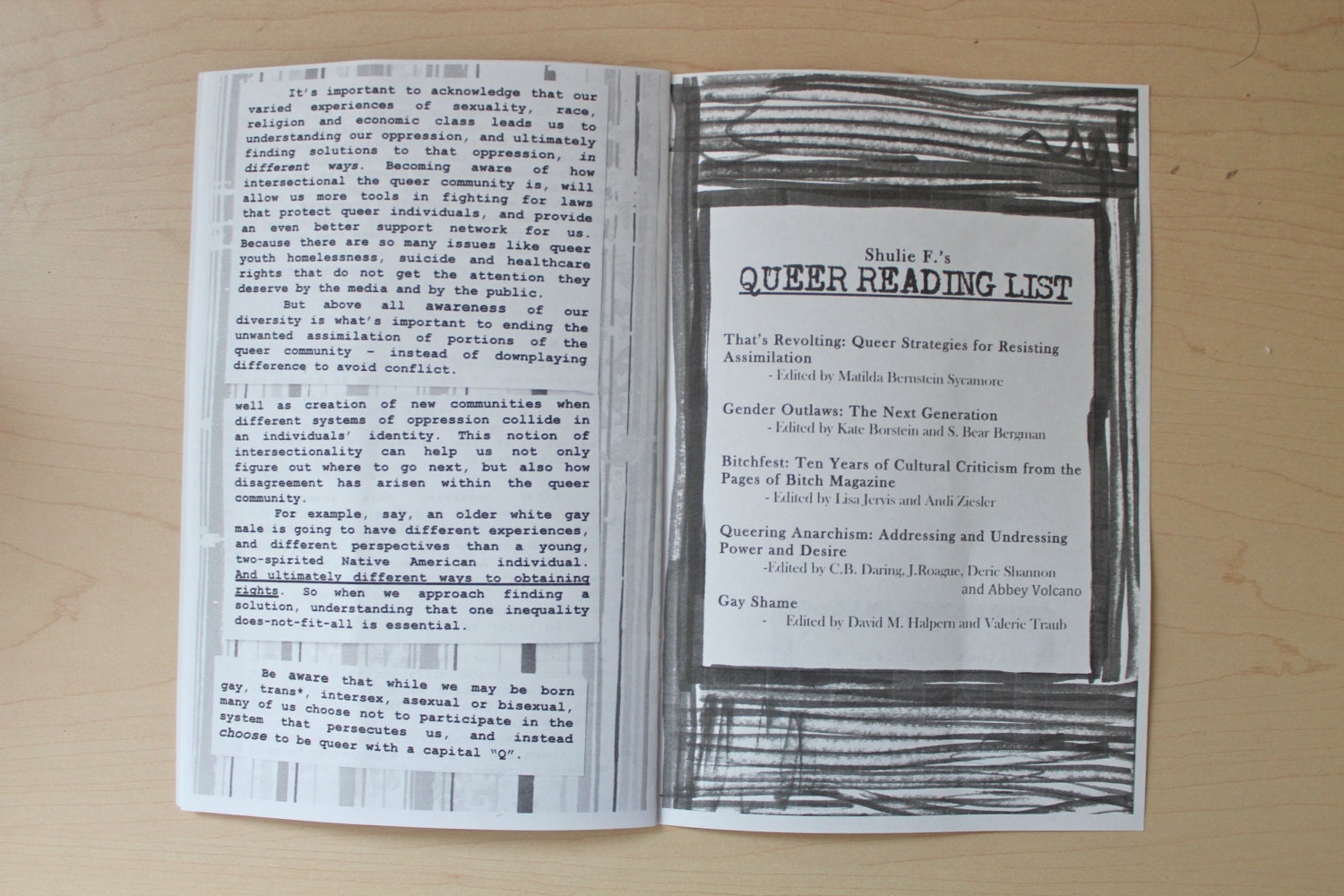
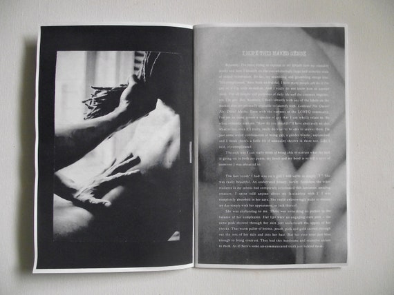
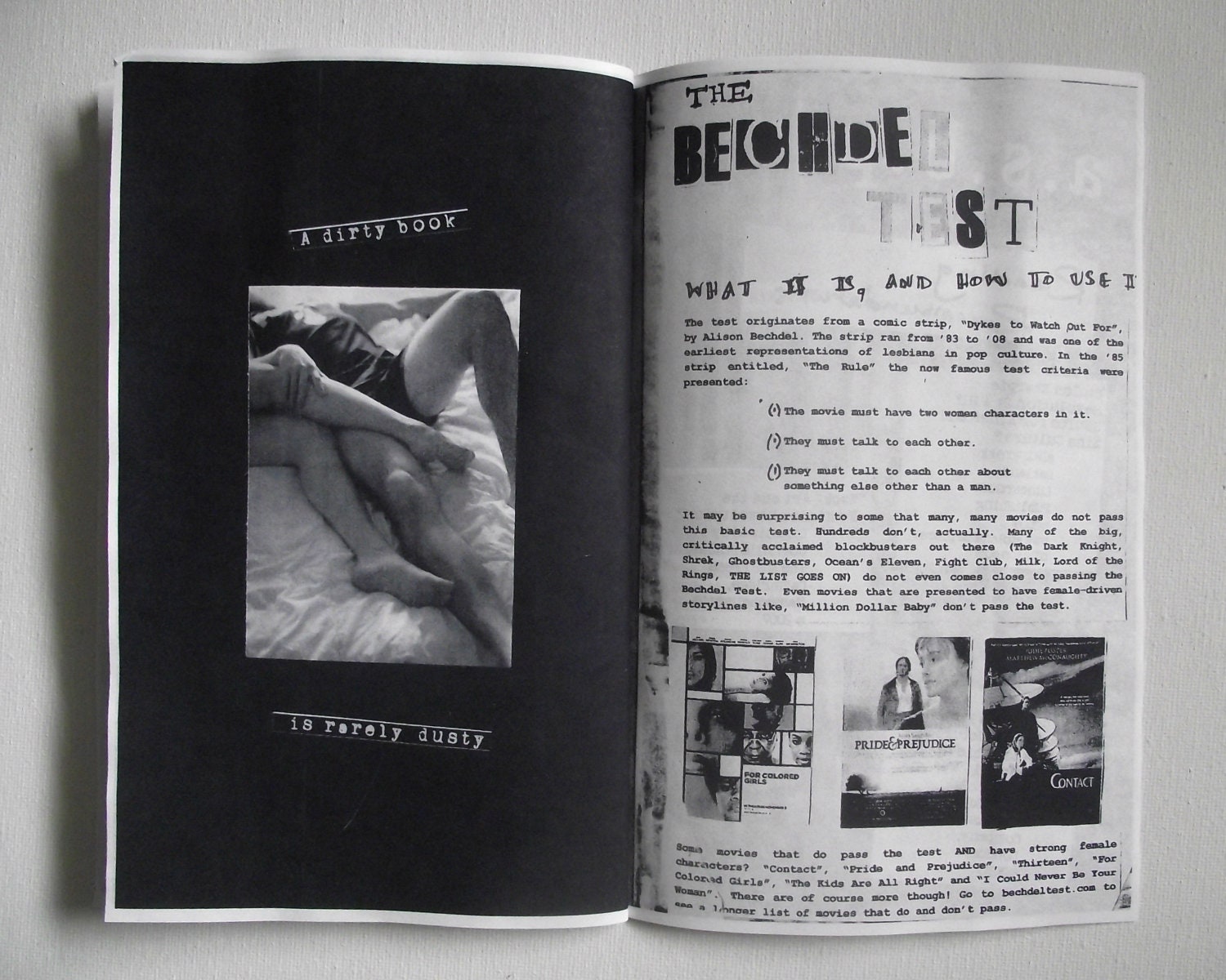
A zine focused around the topic of homosexuality. The publication explores this topic through the use of the cut and stick method. A mixture of digital image and hand drawn doodles have been used to build up layout and create different effects and layers within this zine. As you can see, Courier has been used throughout, which is typical of this type of publication, and content has been typed up first then printed, cut into manageable chunks and pasted into the layout. Although the entire book is greyscale, the layout still has great impact and the DIY aesthetics make it an interesting read.
Art, Sex, Books and Politics, Shulle F.
Digital image has been used in a really effective way within this publication. It has been used a background on a number of pages, which allows for the layering of text and block black colour. This is an interesting way of building up a page so that it is full of relevant content. Whilst many zines are meant to be simplistic, colour, paper and image can be used in order to create a background made up of pattern or solid shape. Text has also been used in a way that is similar to a ransom note, which can be seen quite regularly within these sorts of publications.
Letter to My Younger Self, Scissorkix
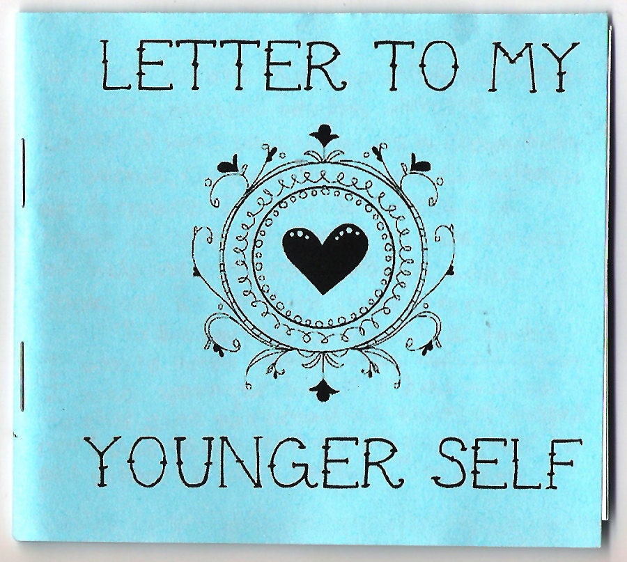
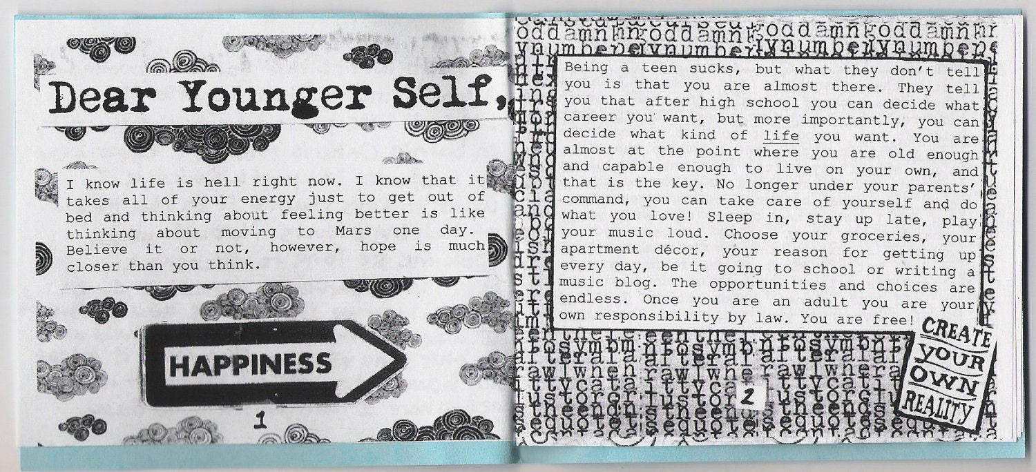
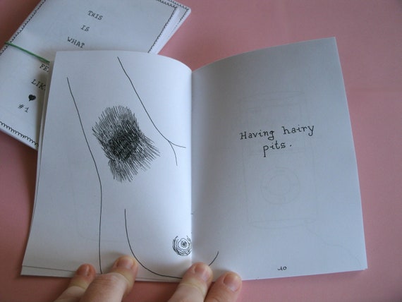
This zine contains a lot of hand drawn text and illustration. Doing everything by hand makes the publication much more personal and shows time and effort. Although all the type and layout is done by hand, it is also effective to include hand drawn aspects on the top of this. This allows you to return to the page and add some personal touches, or add in anything you have missed. A number of zines sometimes include corrections done by hand, which is all part of the aesthetic.
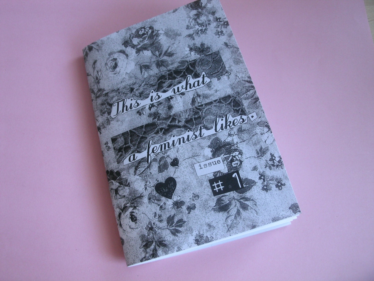
This is what a feminist likes, Hello Mountains
A zine showing how a mix of hand drawn illustration and digital image can be mixed to make an effective layout. This publication also shows how loosely certain parts are cut out, which is all part of the overall look.
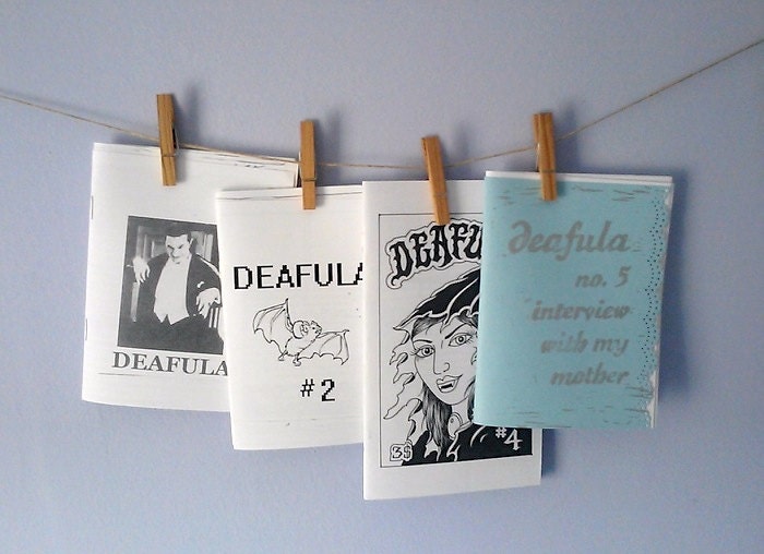
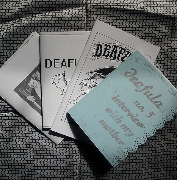
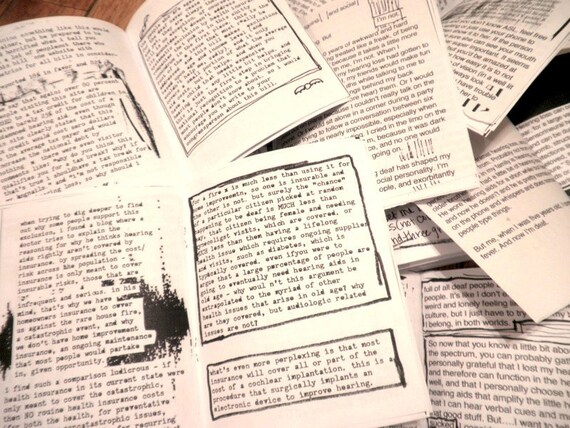
Deafula zine pack, Deafula
Zines in a range of different formats that are sold as part of a pack. A pack is something that I am interested in creating, in order to make the publications more relevant and also more personal.
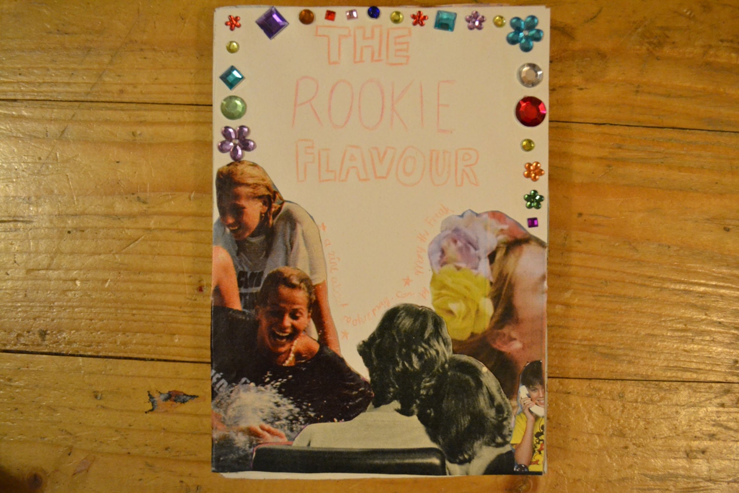
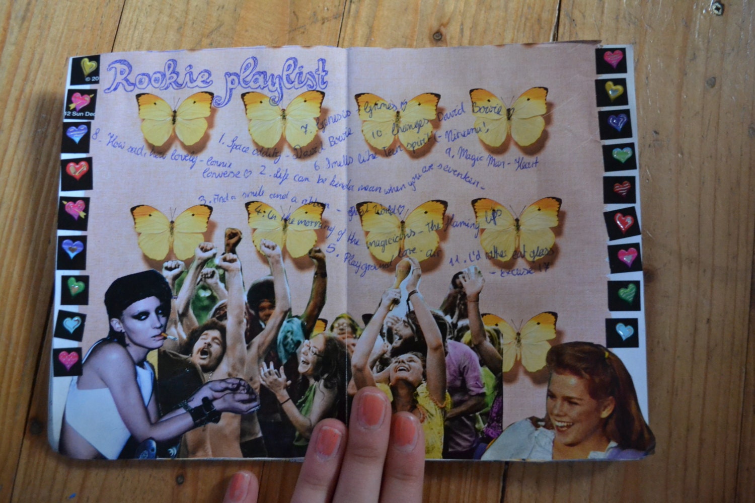
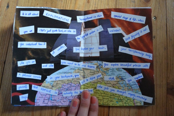
The Rookie Flavour Zine, Mary the Freak
This zine interested me as it as been put together in honour of Tavi Gevinson, who I have researched into on my blog. She plays a big part in the new girl scene of today's society, which is reflective of the original Riot Grrrl movement. This is one of the first zines I have seen that has been put together in colour. This may be because it is only available as a PDF, and therefore has not been photocopied ready for print and distribution. Although I feel the colours are reflective of Tavi, I don't believe it works as well as some of the above zines do. It becomes much more obvious where you have stuck things down and how you have put it together, it looks a little bit more messy and not quite a cohesive whole.
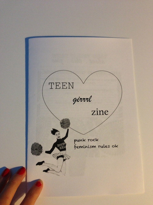
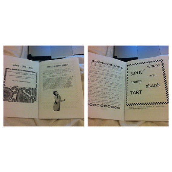
Teen Girl Zine, geelovesyou
A simplistic zine that makes use of clean lines. Each page of this zine tends not to be completely filled, which isn't necessary within this type of publication.
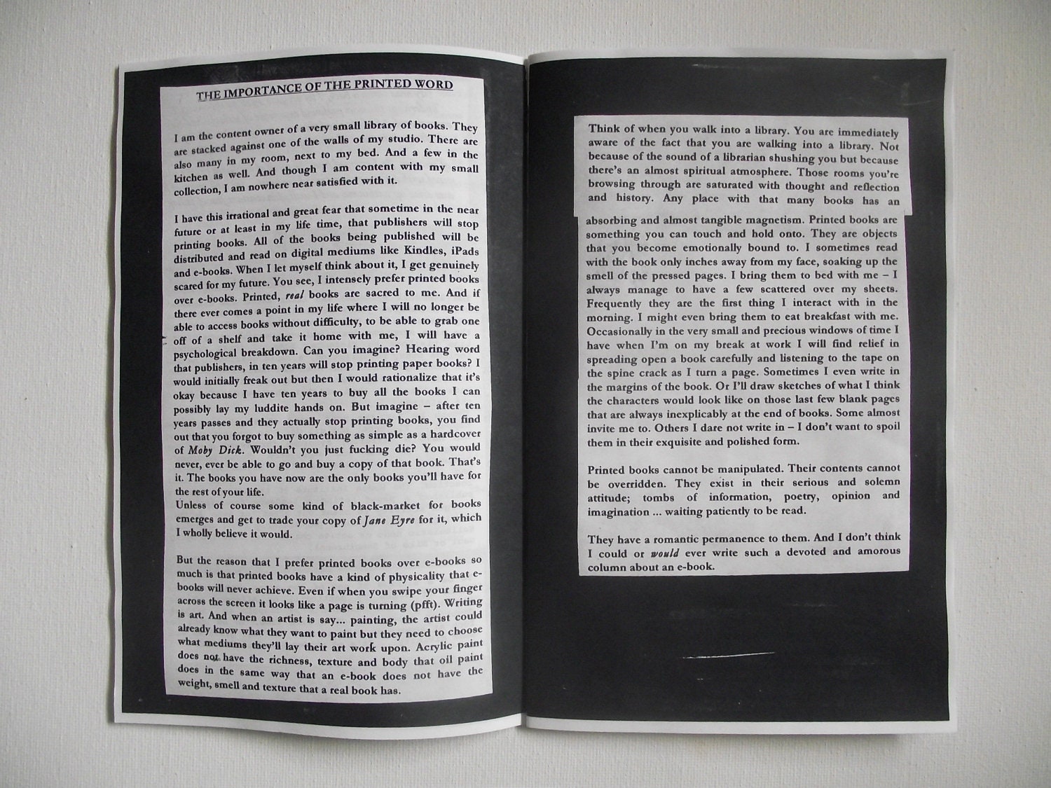
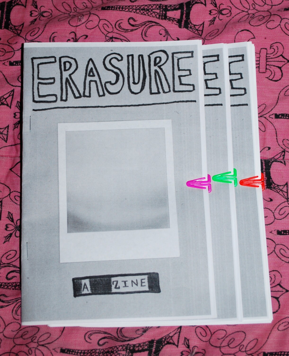
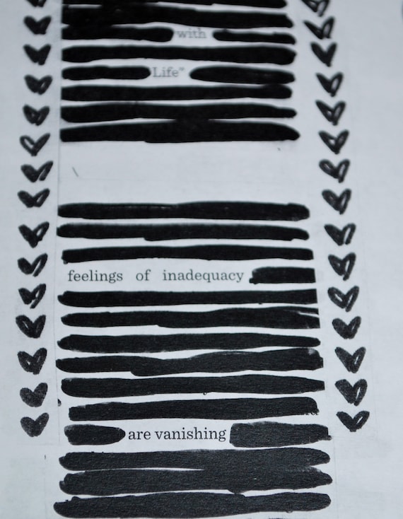
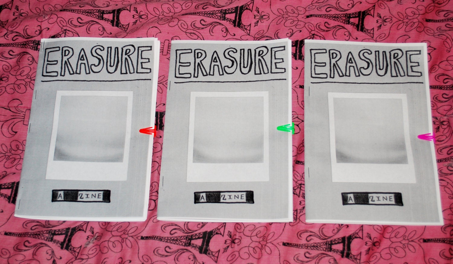
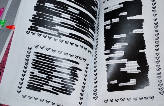
Erasure, SpeakingVerbatim

No comments:
Post a Comment