The work below is something I came across before starting my project. Her work really interested me as she explored certain topics in a contemporary style, whilst still showing a clear and obvious understanding of all of the content she looked at. She states that she is a career crafter and etsy seller, that explores a quirky and retro style. Midge shows a lot of focus on DIY and zines in particular, which will help inform my own work as she frequently explores feminism within this.
On her Etsy, her work is described as 'lady empowering quirky art accessories', and here, you can see how her work has been influenced by feminism and other relevant topics.
Zines
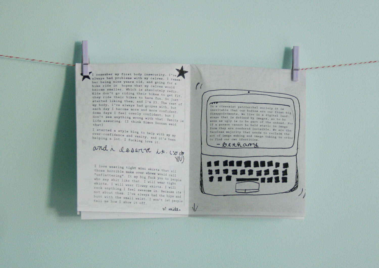
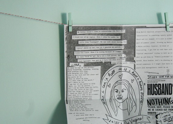
Stigma Zine 002 - Bodies
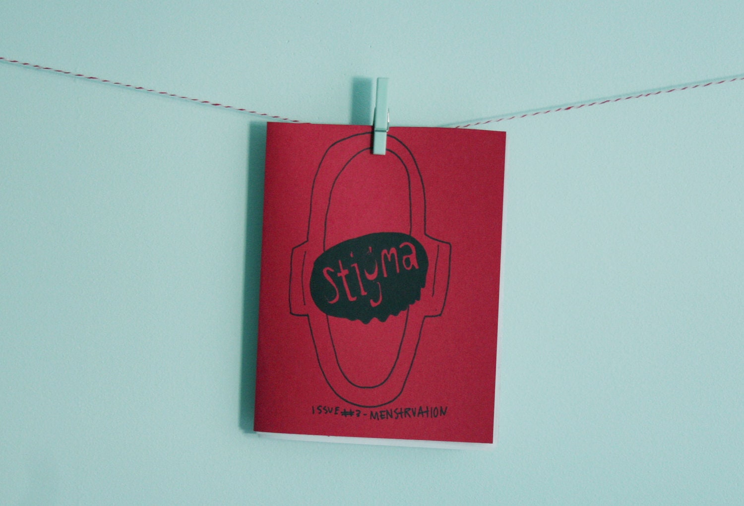
This zine interested me in particular due to the front cover. When creating my zines, I want to explore different colour options, and how I can create a striking cover that is reflective of the content inside. As I hope to produce more than one zine, I will be looking at the possibility of using more than one colour, and therefore wanted to get an idea of what I could go for. As the topic is typically 'female', I was concerned as to whether or not picking colours associated with women was the right path to go down. It's quite interesting to see how Midge works with colour. Although you wouldn't necessarily associate pastel shades with bands linked to Riot Grrrl, these shades crop up quite often in Midge's artwork. She also explores colour contrast, which is extremely effective.
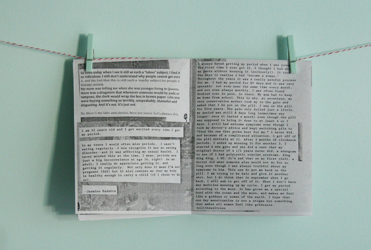
The above images show the inside pages of the zine. It is interesting to see how a use of hand drawn illustrations have been mixed with digital type and image. There is a clear sense of original Riot Grrrl aesthetics here, which is something I evidently want to incorporate into my own publications. Each page has been put together using a cut and stick method, using Courier New as the typeface, which is reminiscent of a type writer and used regularly in zines.
Within publications like this, there isn't really any type of layout that is to be followed. The whole fun behind the process is that you can do what you want and put whatever, wherever. This method allows you to physically lay things out, and work out where you want each piece to go, you can then add to this by hand.
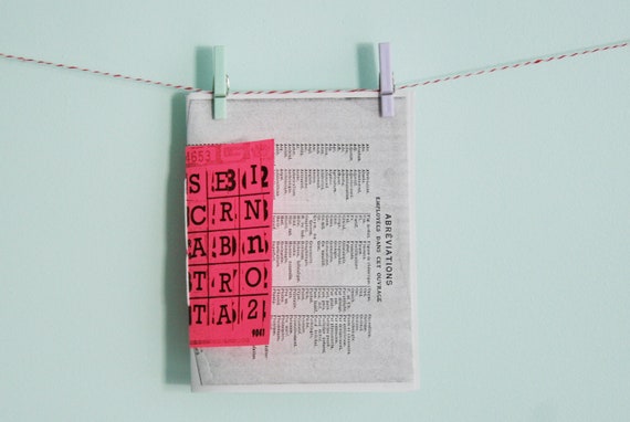
Scatterbrain 002
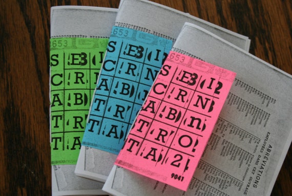
This publication stood out to be not only because of the use of vivid colours, but also because of the use of different formats. By using different paper sizes, the publication instantly becomes much more interactive and eye catching. I feel that this suits the DIY aesthetic extremely well, as it allows you to insert different pieces of information into different spaces within the zine.
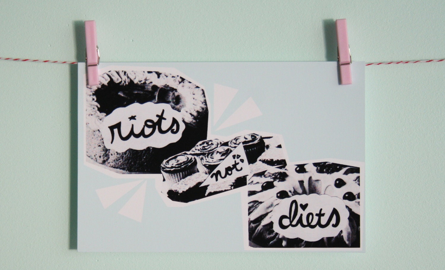
The way the images have been photographed also reflects the content. You definitely get the sense of everything being done my hand, and the use of the string and pegs is a really kitsch way of displaying work. I want to make sure that I photograph my work in a way that reflects my topic.
Posters
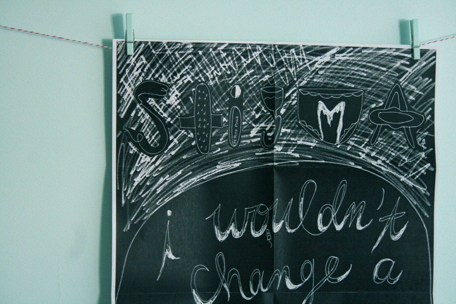
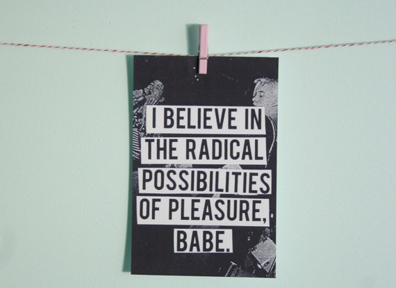
Posters have also been created to go alongside the zines. With zines, you usually get a number of different products free with the publication. These products usually feature images from within the zine itself, offering you a way of displaying your interest in the subject. Once again, these posters have been photographed and displayed in a really effective manner, with a background colour that allows for contrast between the black and white image.
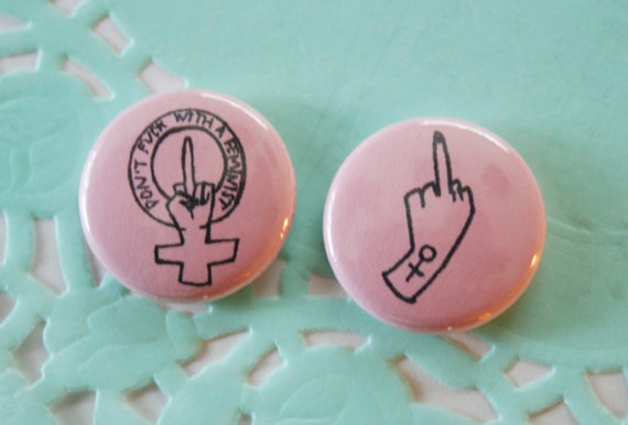
Badges
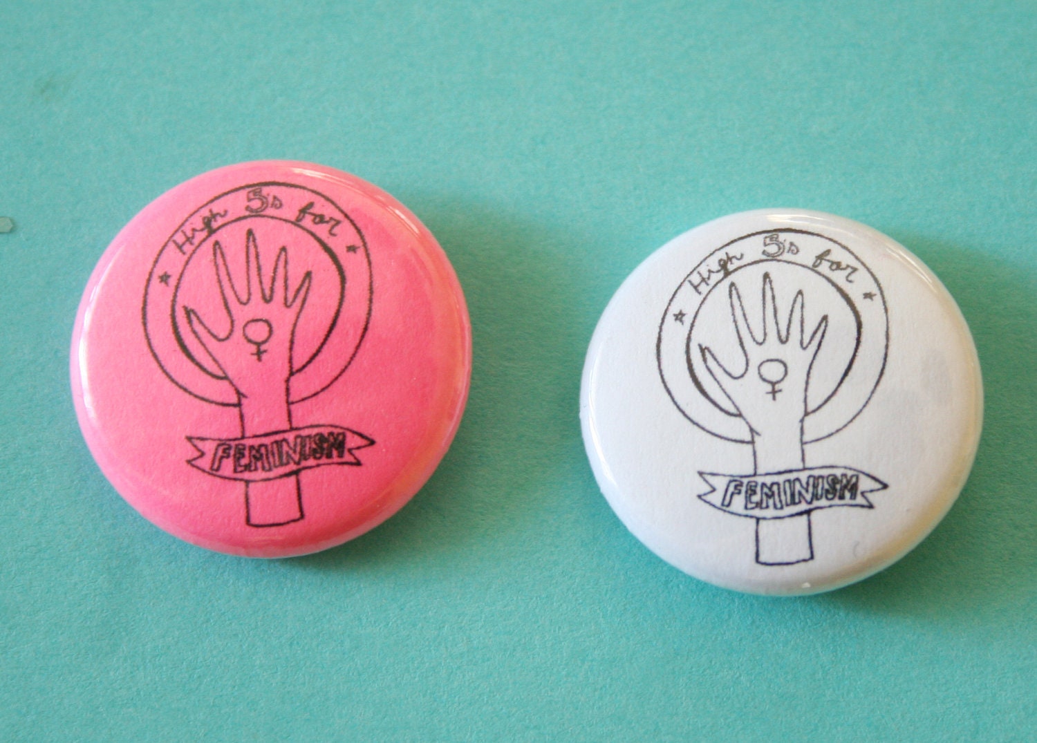
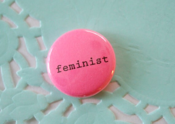
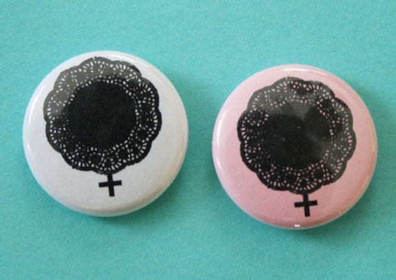
Badges are something that I want to include within my publication. They are extremely relevant to the topic as they reflect the punk rock DIY nature of the Riot Grrrl movement. Badges are regularly seen pinned to clothing or bags as a way of displaying your interests and beliefs.
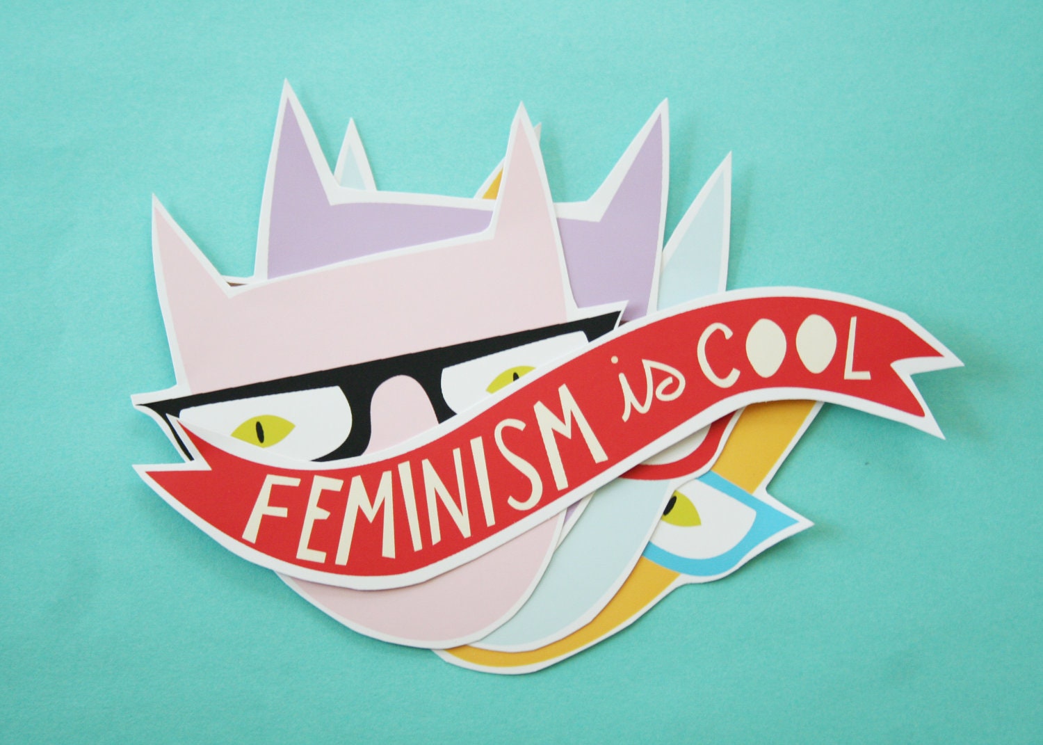
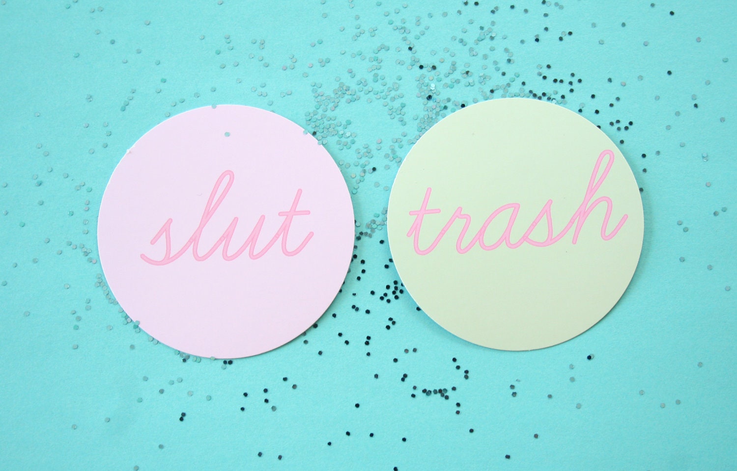
Stickers
Stickers serve a similar purpose to badges by allowing the individual to express their interests and passions. Stickers also allow the individual to create and produce their own hand crafted products, promoting DIY and craft, as well as the subject.


No comments:
Post a Comment