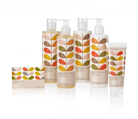
Orla Kiely Geranium by KMI Brands
Although I am not necessarily creating a range of products, the brief does ask for point of sale. This is why I was interested in seeing how a pattern could be applied over different formats, shapes and spaces. Here, the pattern is quite simple, which allows it work clearly over the products. I need to keep in mind that the pattern I design must not be too complicate, as I will be working over three different sizes.
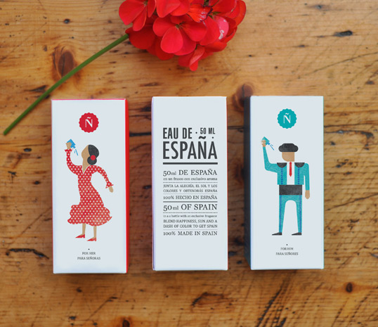
Eau de Espana by Tatabi Studio
These products interested me mainly because of the lovely little illustrations. However, I also felt that they had really cleverly split the two genders, creating a male and female product in a way that allowed them to still link.
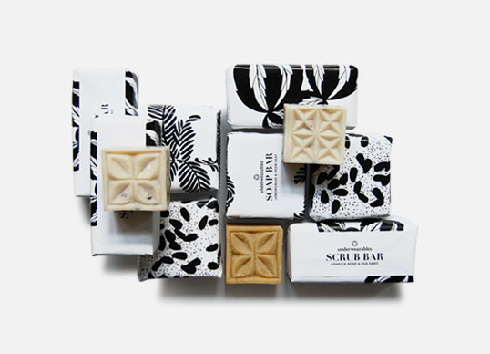
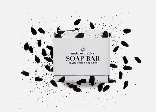
Underwearables by Spread Studio
These products show how a change in pattern, as opposed to colour can create different graphic identities. All the previous products I have looked at use colour to represent scent or flavour, whereas this brand have used a specific pattern so that you can tell the products apart. The restriction of colour creates a really clean and simple design that becomes something really special when put together as part of a range.
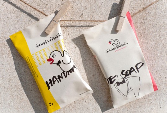
Snob Duck by Marios Karystios
I decided to look at these products as I felt they effectively displayed how graphic identities could be built up for a number of different scents and flavours, which is something that the brief requires. Through the use of colour, type and illustration, these products manage to work as a set, whilst also standing out as a product and individual scent by itself.
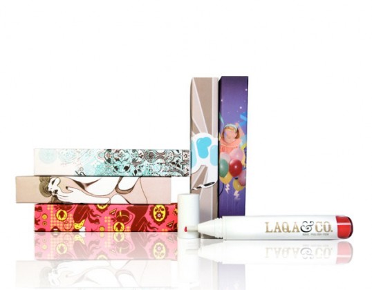
LAQA & Co.
I came across this beauty brand whilst scouring for inspiration on Lovely Package. LAQA & Co. describe themselves as a start-up cosmetics brand that wants to stand out, but also stand for something. They claim to provide inspiration for young women to achieve their goals in life and also to provide alternative roles models for them, as opposed to the usual individuals. It was really fascinating to learn about their packaging as it turns out that they decided to use it as a canvas for young artists, allowing them to feature specially commissioned work. The artist then received a profit share of the product they created the artwork for. The colour is the product is there to help inspire each piece of art, which then becomes a keepsake, something the consumer can hang on their wall. Although some products showcase up and coming designers work on their limited edition lines, I have never seen this being done on a permanent range. I also felt the designs were rather reminiscent of Paul & Joe.
In order to find out more I decided to visit their website, which was a really worthwhile experience. Their website not only featured a shop, but also a page designated to the designers, as well as a banner for designer of the month.
The artists page also includes interviews. Whilst browsing the shop, I also found that they had created gift boxes using the artist's design. All products were reasonably priced, but would be up there with the likes of MAC and other high end brands.






No comments:
Post a Comment