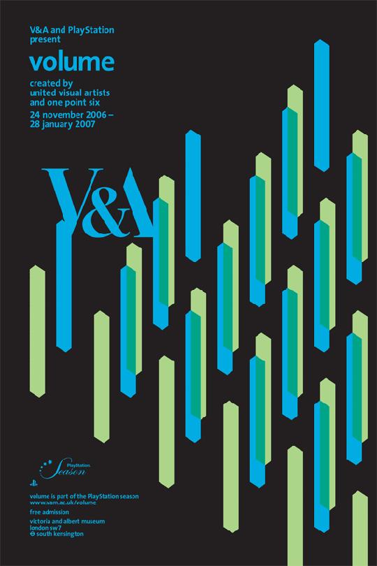
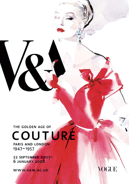
As you can see from the below posters, the V&A have very varying visuals when it comes to their exhibition posters. The aesthetics and design is very much dependent on the subject matter and the content of the exhibition. The only thing that will ever stay the same is the inclusion of the V&A logo. Also this sometimes may change size, colour and forms, the typeface is always kept the same so that it is easily recognisable as the V&A. They hole a wide ranging amount of exhibitions, covering a whole range of topics from fashion to childhood toys. Each poster is extremely personal and unique to it's topic, creating a broad spectrum of ideas and possibilities.


No comments:
Post a Comment