Work that will appeal to a younger audience - more likely to see things as light hearted, see the humorous side to things, less likely to get offended by certain images.
Included as an insert in Boat magazine's latest issue devoted to all things London, we came across this A-Z of London Street Food leaflet, designed by Kate Hyde.
Once unfolded, one side of the folded A3, four colour risograph leaflet has illustrations of various street food vendors and their vans, carts and stalls, all placed to hint at their location in London.
Really effective use of simple illustration, limited colour and hand rendered text. This is something I want to focus on, as it will allow my posters to be 'less subtle' but in a way that isn't overcomplicated and busy. By doing things by hand, the overall aesthetics will be a bit more playful, contrasting with the deeper meaning of the proverb, which should balance it out.
Adding humour through illustration - adding play to a serious situation.
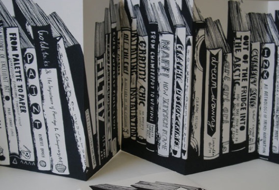
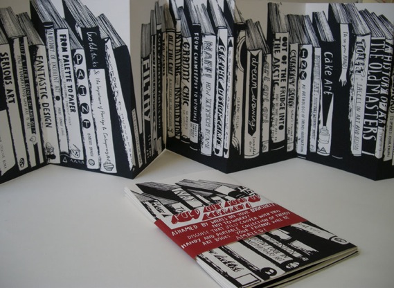
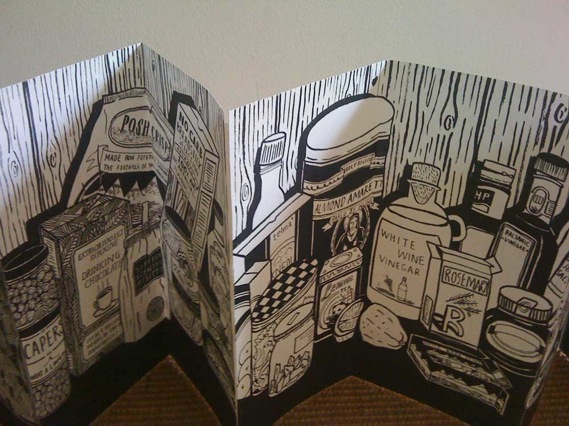
"If you have an embarrassing bookcase with lots of Mills and Boon or the Twilight books or something, you fold out my book shelf cover and put it in front!" says Greenberg on her website. "The kitchen one [below] has lots of foodie feastables and you can pop it over your kitchen shelf when you have nothing but pot noodles and stale crackers."
More work by Isabel Greenberg...


No comments:
Post a Comment