
The plan is to split my zines into three, however, I am unsure yet as to whether or not this will be three separate zines, or one zine that is somehow split up. The three themes are: Riot Grrrl and their beliefs, DIY aesthetics and music.
Riot Grrrl
One
Throughout past Riot Grrrl publication, you will see a lot of similar imagery, including hearts and stars. This is where the idea of the locket necklace came from, which is open, allowing me to place the titles inside.


A stock image of a heart shaped locket was use in order to create a simple outline, trying to make sure that there was enough white space within it to allow illustration to be added inside.

A simple title was created using a tablet so that the handwritten style came across. In many cases, Riot Grrrl have been seen to use the female gender symbol on the 'o' of Riot, which is evidently representative of who they are. This was included along with other details.

The two were put together so that the illustration could act as the title to the publication.


Originally, my plan was to do all of my illustrations in colour. They would then be printed and photocopied in black and white to create the zine aesthetic. However, it made much more sense to simply do the entire zine in black and white as I feel this is much more reflective of the content and of the original publications.


In order to 'modernise' the idea slightly, I am considering the use of spot colour. This way, I can add simple blocks of bright colour to certain areas of the publications, in order to highlight and make aspects stand out. It will also give me something to experiment with with it comes to binding and including different formats of paper sizes. I am hoping to use fluorescent colours, specifically pink or orange. As these don't show up on screen, I have simply chosen colours that are closest to the real thing.
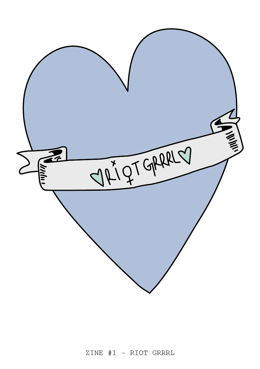
Two
Banners are seen quite frequently throughout zines, so this is something I wanted to experiment with. It also gave me a space to include my titles. I used similar aesthetics to the illustrations above, and kept the same title.


As previously mentioned, I have included small bursts of colour, in order to add something extra to the designs. I feel that this design may be more effective than the previous, as it is more stand out, and isn't too specific in terms of illustration. This will allow me to experiment more within the zine.
I have also included text on the bottom, station what number the zine is, and the title. The typeface used is Courier New as this is well used within zine culture. It is also works well in a cut and stick style, and is reflective of a type writer.
So that I wasn't pigeon holing my ideas, I decided just to explore colour a little bit further. To get a sense of colour schemes used when this kind of content is being covered, I researched into feminist zines and also scoured Etsy for stickers and posters on Riot Grrrl. Surprisingly, a lot of the colours used were pastel shades. The only reason this was surprising is because usually you would expect them to go against the grain, and choose colours that weren't stereotypically 'girly'. However, the whole point may be this contrast between the content and the colours used. These shades are very reminiscent of Meadham Kirchoff, and the previous publication I produced, which is why I am choosing to steer clear of them within this publication.


Front pages 1-3


My original idea was to have all three covers the same, with alternating titles. However, when looking at them, it seems a bit stupid to have the exact same design for each different book. I am going to scrap this idea and try and incorporate the locket design and one other design into my front covers so that there is clear difference between the three.
Alternate covers


No comments:
Post a Comment