Monday, 30 January 2012

COLLECTION OF FONTS

Someone over at Magic Jelly just loves collection circus typefaces, claiming to spend days trawling through the internet to find them.

Here are there chosen ones.


Big Top
De Louisville
J F Ferrule
URWWood Typ D
Cast Iron
Circus
Pointedly Mad
Armenian Circus
Hoedown
Romantiques
Coney Island
Abilene FLF


Wild West (West Wind Fonts)
Bosox (Lee Gordon)
Tuscan MF (Rick Mueller)
Circus Ornate (Dieter Steffmann)
Movieola (Emerald City Fontwerks)
Spatz (Lorvad)
JF Autumn Fair (Jester Font Studio)
Beans (Benny Demmer)
Beeper (someshinzz)
Shadowed Serif (James Fordyce)
Joe Clement (Character)


Thursday, 26 January 2012

POPCORN BOXES

LUCKY POP

'In my packaging design class we were given the assignment to create a new popcorn package for a small movie theatre in Rochester. The assignment required that the package be original in form and bring out something exciting and new to movie goers. My popcorn package was inspired by the fortune cookie. Movie goers would find their fortune inside the box. The box took the form of an over-sized Chinese food takeout container. This form lends well to movie theatre popcorn in that it folds flat for easy assembly.The box lid allows you to easily bring leftover popcorn home with you and while it's open it helps keep the popcorn inside the box. The boxes come in different colors emphasizing how each one is unique. The traditional popcorn box of the 1950's is subtly referenced by the stripes inside the package'
(http://www.lesferr.com/lpo.html)
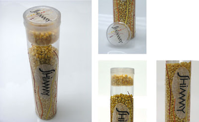
SHIMMY


'Shimmy popcorn is packaging for 75 cents worth of popcorn. The clear packaging highlights the visual appeal of the kernels. The chamber at the top of the cylinder allows the consumer to measure the amount of kernels needed for one batch.'

(http://jennhig.com/archives/131)

VIM


'Designed by Diana Chirilas, Sweden. The concept and design was created as a part of a competition brief for Blue Marlin, Sydney 2011. 

"With a target audience of sophisticated, environmentally aware and health conscious snackers the Vim popcorn packaging came alive as a green product using only recyclable materials. The innovative packaging design allows the user to fell in control as they decide how much of the product they wish to consume.
Kernel and popcorn shapes were embodied into the shapes of the letters in the logo, giving a friendly and elegant feel to the brand. The word Vim is associated with energy and enthusiasm, representing both the popcorn and myself."

(http://www.packagingoftheworld.com/2011/01/vim-popcorn.html)

DR. OETKER


'This packaging for microwave popcorn design created by Diego Aguilar, possess a great advantage and market design. Very practical, possessed opening at the top of the pack, and an elegant and sophisticated design, highlighting ingredients attract consumers to the special flavor of popcorn. Unlike all of the packages on the market, has great call quality of ingredients used in manufacturing, making it a premium product.'

(http://www.packagingoftheworld.com/2010/06/dr-oetker-popcorn.html)

SALTY AND SWEET


'Golden Popcorn came to us with a problem. They wanted to introduce an exciting new product to their existing range of Salted Popcorn and Sweet Popcorn. The new product was a mixed bag with both flavours (we thought this was very strange indeed until we tried it.....now it's our favourite!)

Turned out the task wasn't just as easy as we thought it was going to be. We wanted this packaging to leap from the supermarket shelves and straight into your trolley. However once we realised that that would require a lot of moving parts and springs and sensors,  we decided we would have to do it through the power of design alone!
We gave the client two options: one that nestled neatly with the two existing products in their range and which was exactly what they had asked for, and one that encapsulated what we thought their product could be but which didn't fit into the range.'
(http://paperjamdesign.com/news/Golden_Popcorn)
MILK

(http://www.milk.se/)

MARTHA STEWART PACKAGING TEMPLATES


(source: martha stewart)

Wednesday, 25 January 2012

GLASSINE BAGS

Different uses for glassine bags.

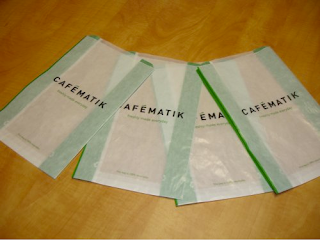
'Glassine is a paper product that is resistant to grease, air and water. A special manufacturing process is required to make this type of paper, and it can be expensive because a single sheet represents a great deal of work in a paper factory. There are many uses for glassine, ranging from archival protection to laboratory work. Various paper suppliers make and sell it in a range of colors.

How it is Made

To make glassine, paper pulp is beaten to break down the fibers. The pulp is pressed into molds and allowed to dry into sheets. The sheets are pressed through hot rollers in a process called calendering, which makes the fibers lie flat and in the same direction. Glassine is considered supercalendered paper, because it is subjected to the process multiple times. The end result is a very smooth product that can be used as barrier protection from many substances.

Appearance

Basic glassine is almost transparent, with a neutral color. The color can be changed with the addition of dyes during the pulping process, and some companies also make opaque varieties using other additives. Many people prefer this product in its semi-transparent form, because it allows them to see what is lying underneath it.'


(sources: wisegeek, tamryn kirby blogspot, i-do-it-yourself, citizens for cake and craft)

A short but sweet article on the waxy bags below

http://tamrynkirby.blogspot.com/2011/06/i-love-glassine-bags.html

WINDOWS

Clear visible windows in use.

Really lovely way of allowing you to take a look inside. Great idea for sweets due to a nice range of colours.
Makes the product a lot more tempting, and will draw people in. All about the idea of having greedy eyes, children will be especially attracted by this design. 


Interesting way to package popcorn, not just sweets. Not the 'usual'.


(Sources: sweet lulu, pipii)

SWEETS

Looking at different ways of packaging sweets
- bags
- boxes
- cups
- baskets
- containers
- totes
- jars
- stands


Die cut, high gloss paper bags in a variety of colours. These are a really nice way of changing something that is originally quite simple. Through the use of pattern and a simple die cut, these paper bags have been transformed. The use of cut out is something I want to look at. The purpose of this could be as a handle or to show the contents of the bag.


Party favour bags. Biodegradable, recyclable, semi-opaque, and food-safe.
Simple text or pattern has transformed these simple party favour bags into something extremely fun and appropriate to a younger audience. The product becomes a lot more playful and becomes something that perhaps the buyer would want to keep.


Candy cups.
Different ways of presenting the type of sweets that you would receive at the circus. As the confectionary needs to be easily accessible during the show, this is possibly something I could look into using. However, this is not something really that the consumer could carry home or put in their bags to eat later.


Treat boxes with clear visible windows.
These visible windows seem like a great idea. I want to have a go at creating something a bit different, and will look at mixing this idea in with the party favour bags.


'Old fashioned thin glazed semitransparent glassine bags. Grease and moisture resistant, sweet and simple, these lovely bags are perfect for presenting and wrapping sweet little treats.

Glassine bags were first invented in the 1920s so this makes these a perfect "vintage" bag for packaging, wedding favours etc. They feel and look lovely. Wrap with ribbon or Bakers twine for a great presented gift.'

(source: sweet lulu, pipii)